Real Estate|Housing
A place to simply be
Olo, Rize Alliance Properties
Real Estate|Housing
Space for living carefree
Joo, Asuntoyhtymä Group
Hospitality|Luxury|Destinations
Serving new levels of luxury
Fairmont Hotels, Accor Group
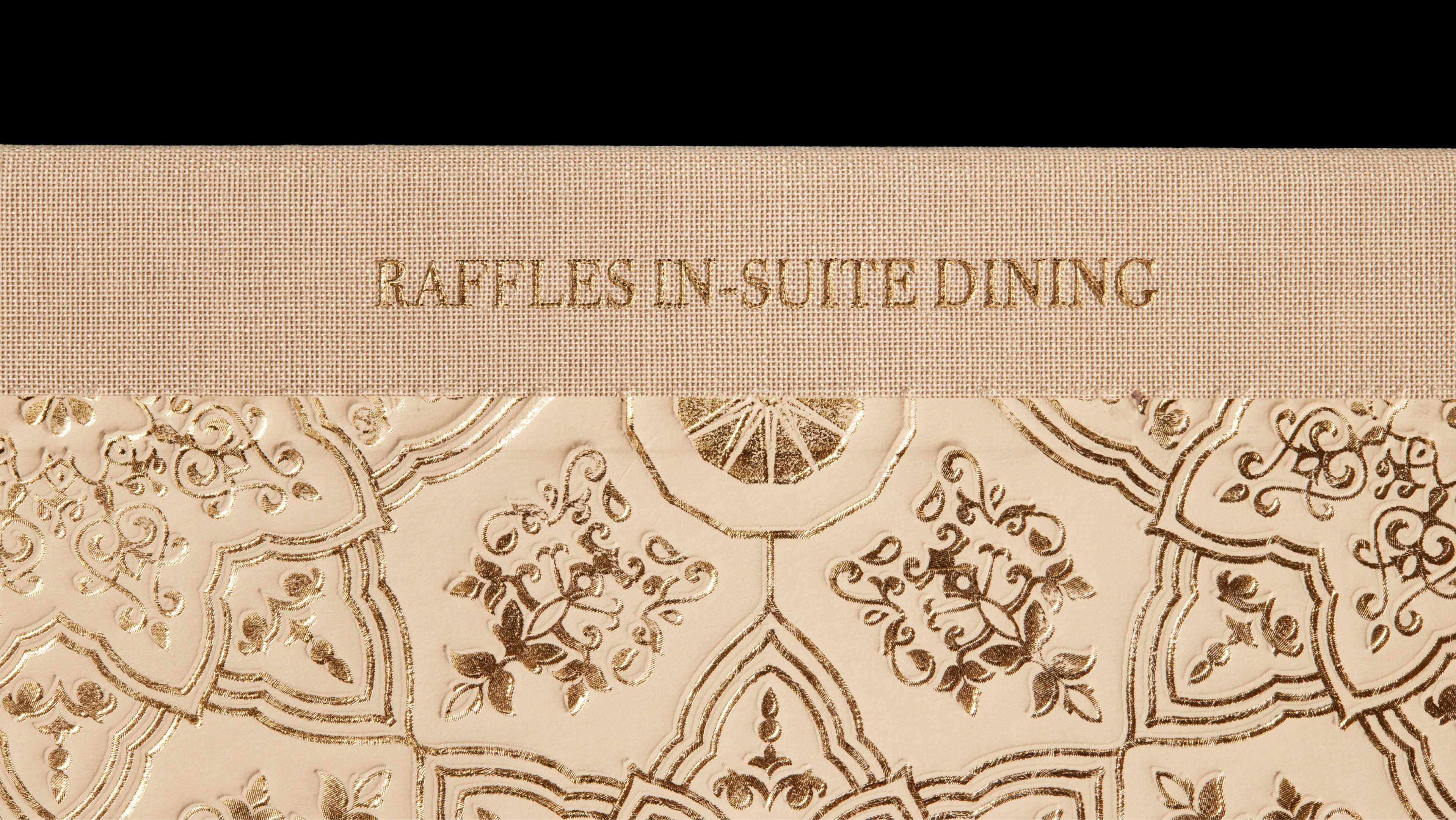
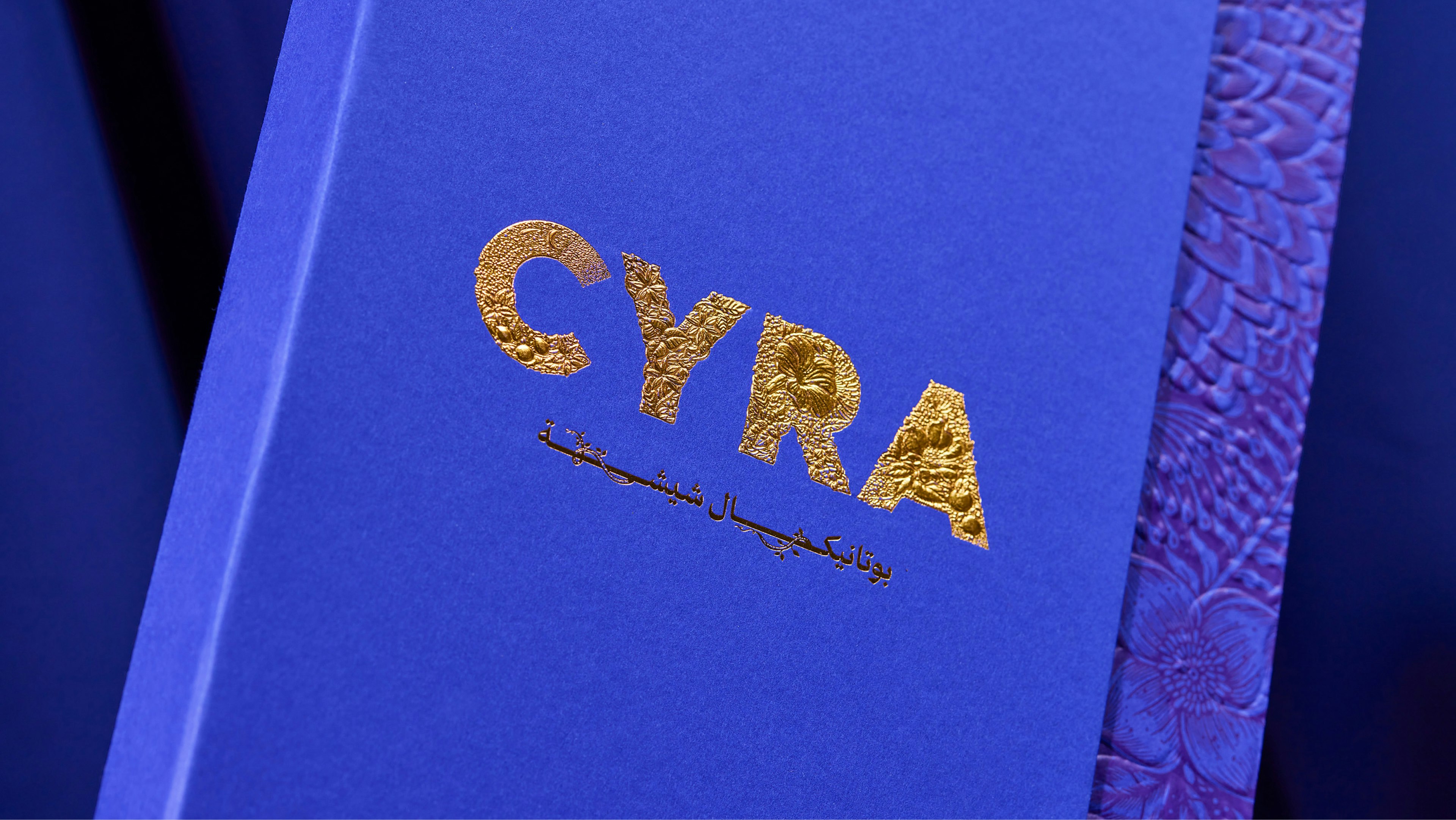
Hospitality|Luxury|Destinations
A story of delicious detail
Raffles Hotels, Accor Group
Gaming
10x’ing installs and doubling player retention
Merge Gardens, Futureplay
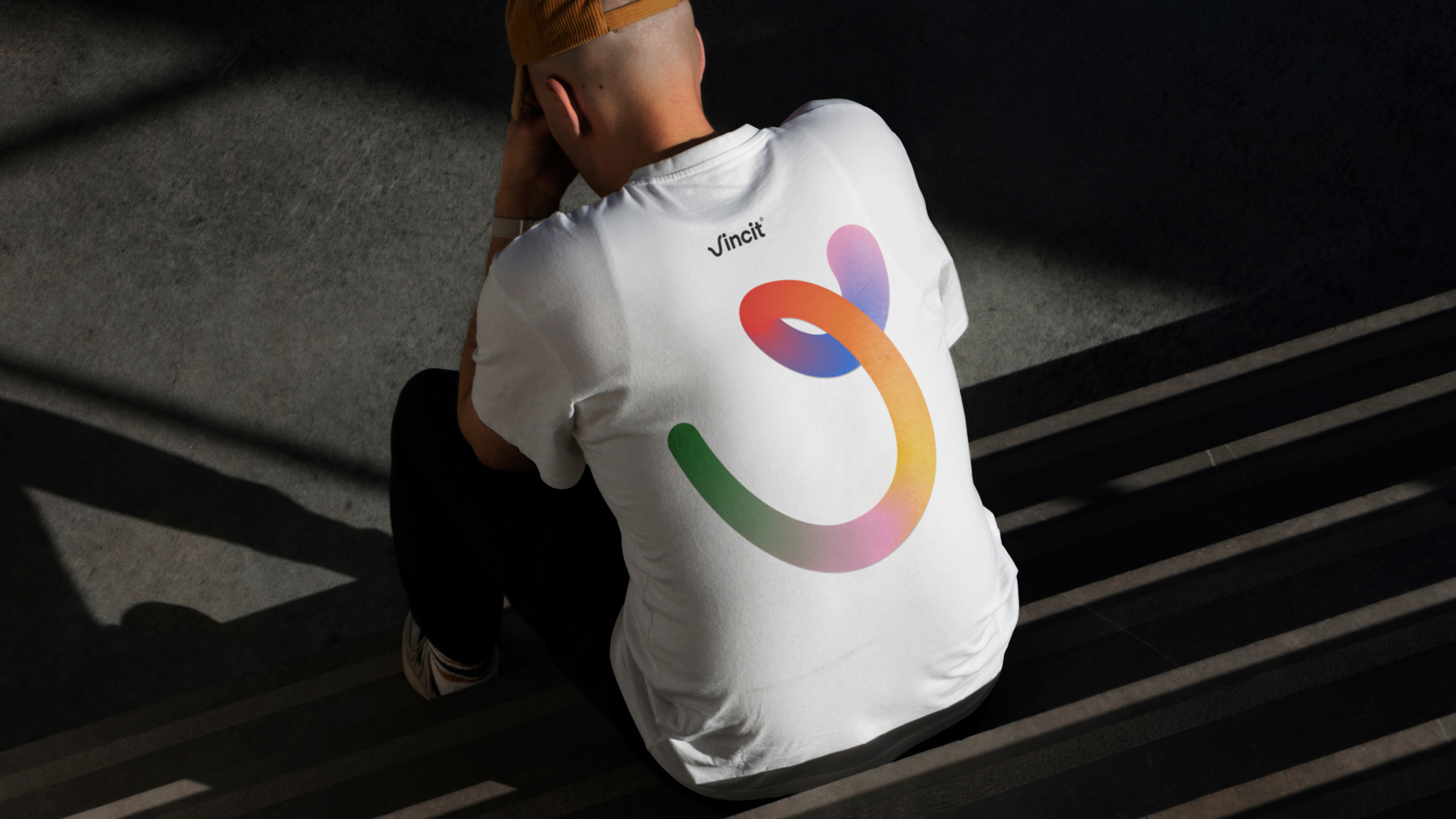
IT|Technology
Embracing the learning curve
Vincit
Real Estate|Retail
The Bold Town of Tallinn
Rotermann Quarter, US Real Estate
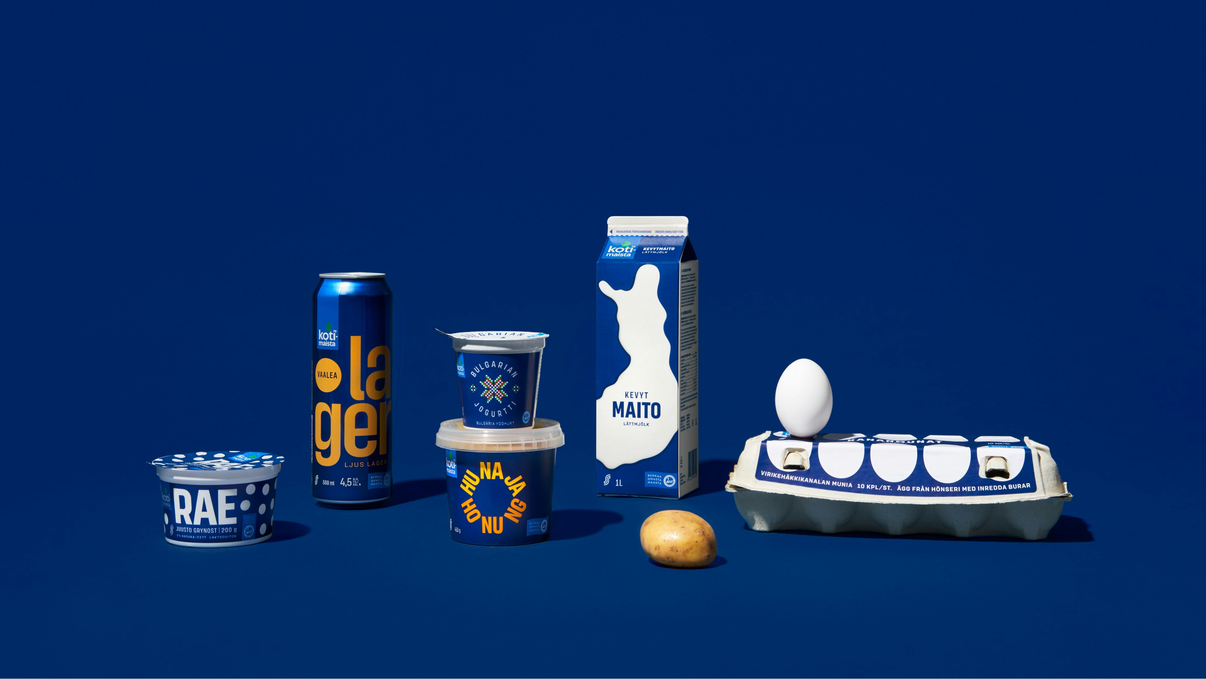
FMCG|Retail
The brand growth story of the year
Kotimaista, S Group
Arts & Culture|Real Estate|Workplace
Where people and the new meet
Cable Factory
Food & Beverage|Green Tech
Turning stake on its head
Aleph Farms
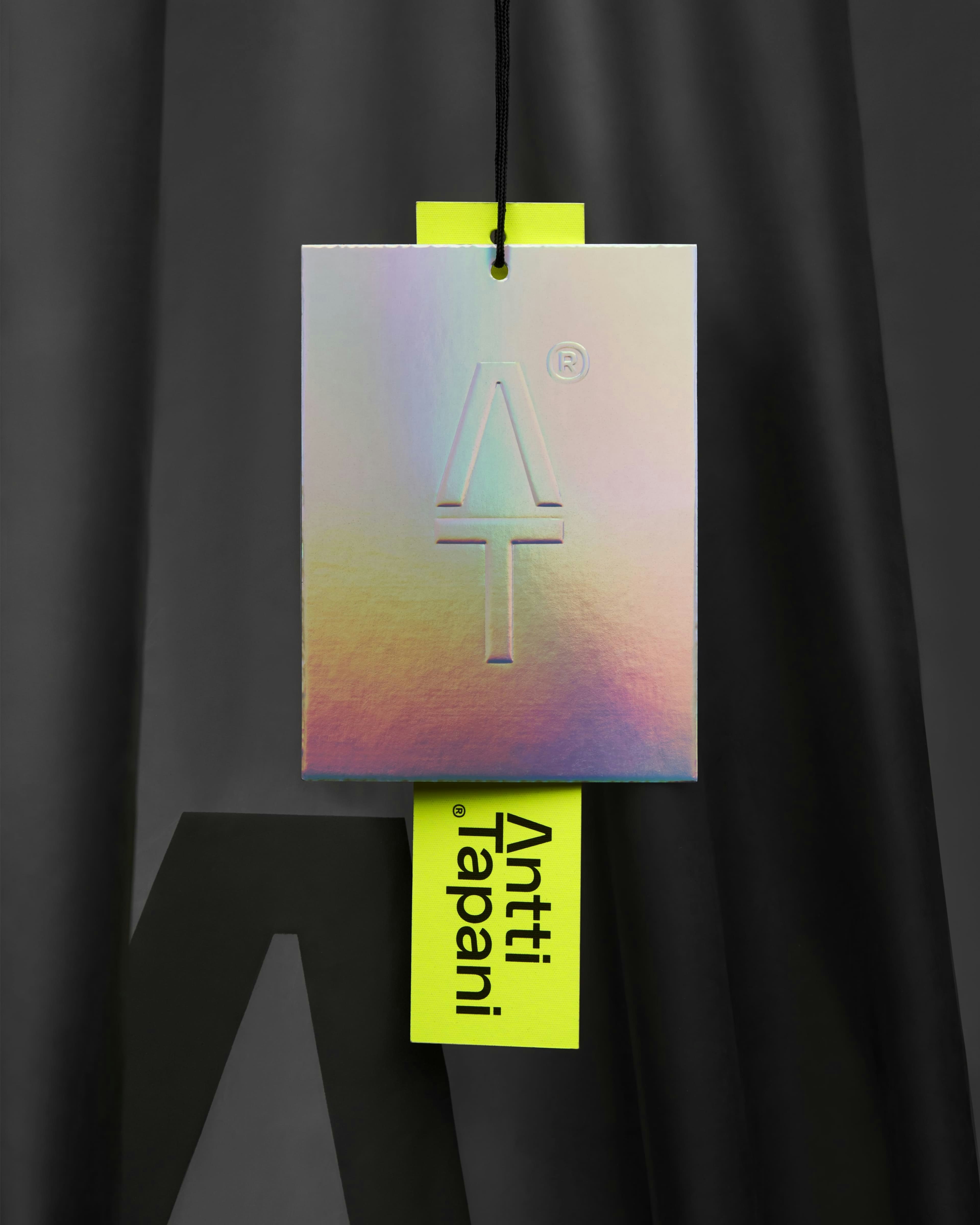
Fashion & Apparel|Retail
A bit like Kim Kardashian but in Finland
Antti Tapani, S Group
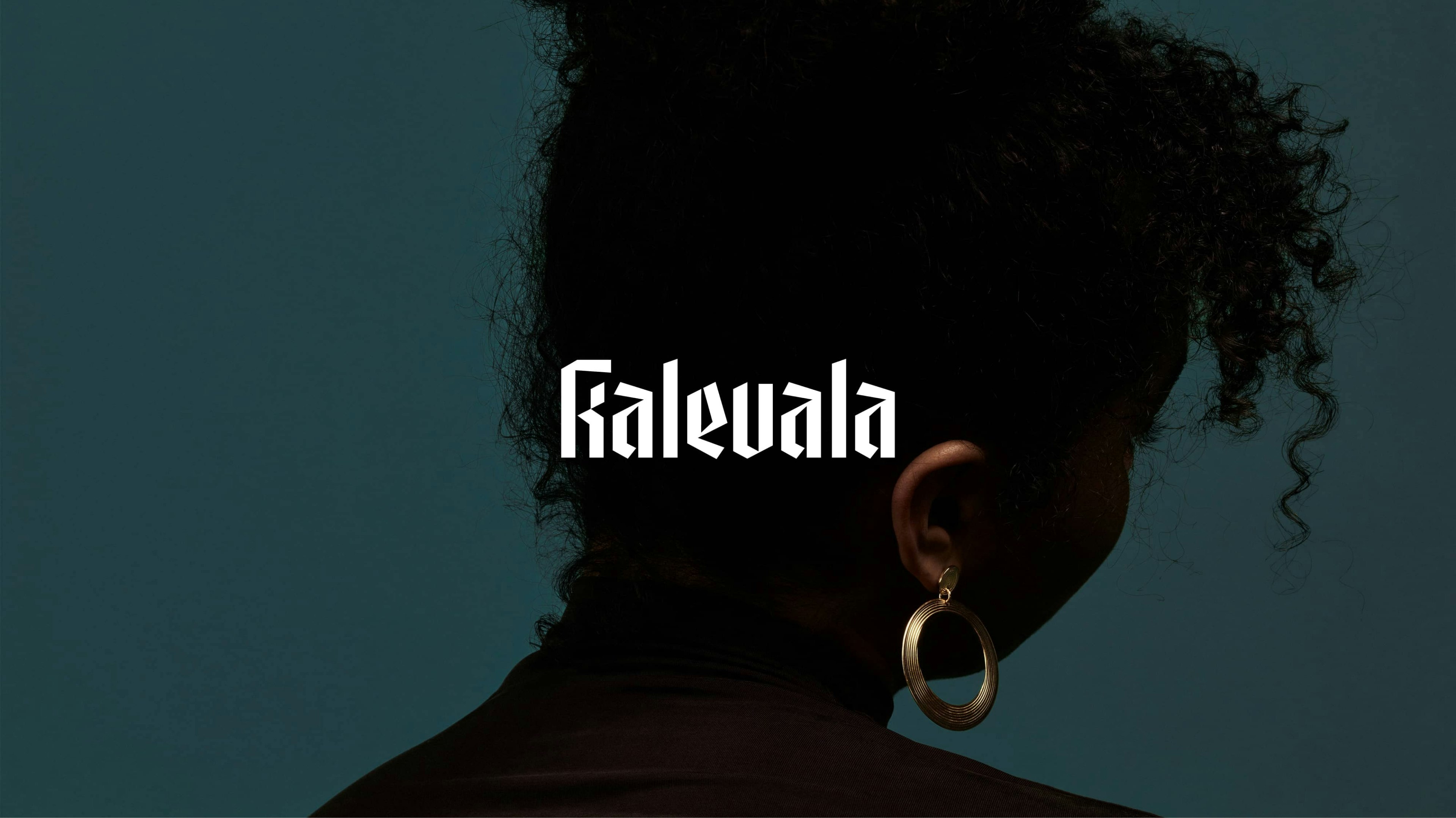
Fashion & Accessories|Retail|Luxury
A new era for a legacy brand
Kalevala Jewelry
Hospitality
From historic orchestra to symphony for modern ears
Helsinki Philharmonic Orchestra
Retail
Making a Finnish staple international
Raisio

Green Tech|Mining & Metals
Doubling share-of-search for sustainable stainless steel.
Outokumpu Circle Green

FMCG
What you see is what you get
Cloetta All Sorts
For new business inquiries please use the form and we’ll get back to you.
BOND Agency LLC needs the contact information you provide to us to contact you about our products and services. You may unsubscribe from these communications at any time. For information on how to unsubscribe, as well as our privacy practices and commitment to protecting your privacy, please review our Privacy Policy.